- No results found for query "" 😔
Color
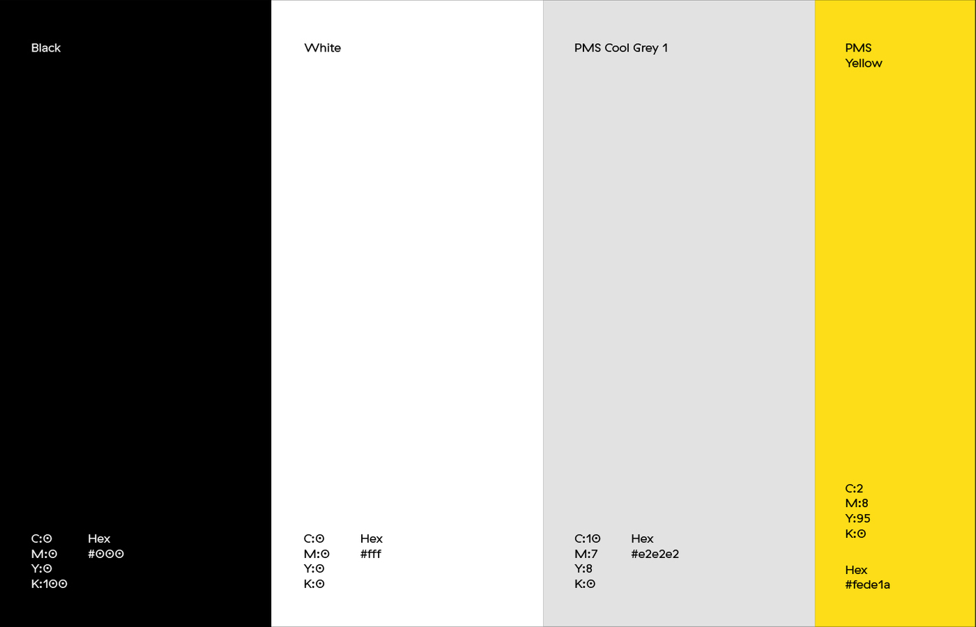
Our color palette
Our color palette refers to our brand values. We use black, white and grey to convey a ‘boutique and idealistic’ feeling. We use yellow for our ‘bold and casual’ value. Keep in mind that yellow must be used in moderation, and only if it fits. Do not force the yellow just because.
Logo color usage
When using the logo, make sure to turn to one of the upper two examples. A white logo is not supposed to be displayed on a yellow background. And a yellow logo is not supposed to be displayed on black background.

Correct color usage
Like we mentioned: yellow is supposed to be used in moderation. The example below shows how it is supposed to be used. It puts emphasis on the ‘++’ part. It adds that little touch of boldness.

Incorrect color usage
The example below shows how it is not supposed to be done. We are no Mc Donalds, remember that.