- No results found for query "" 😔
Logo
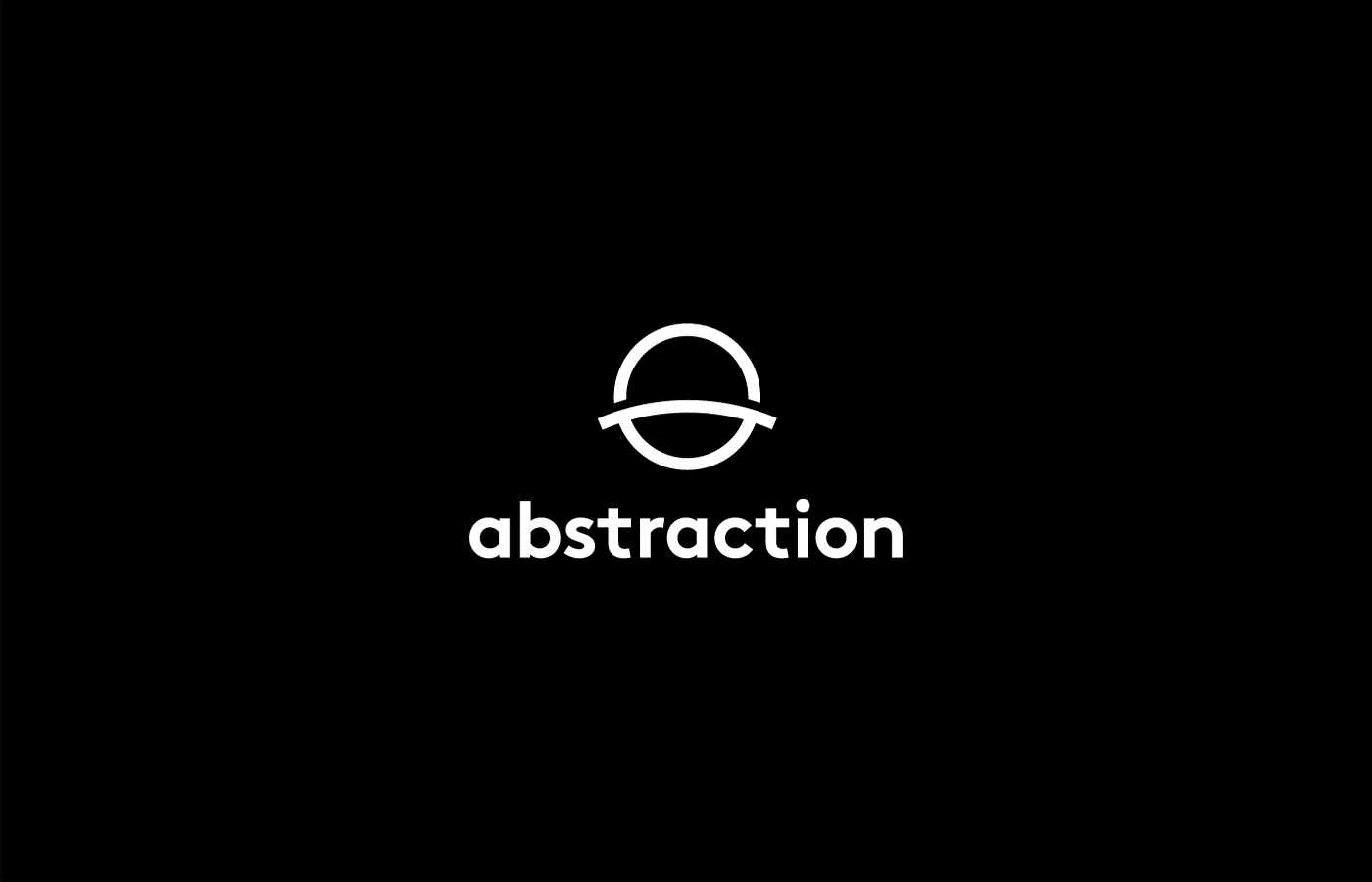
Combined logo
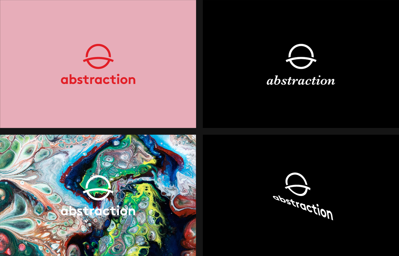
This is our primary, combined logo. Note the vertical lockup.
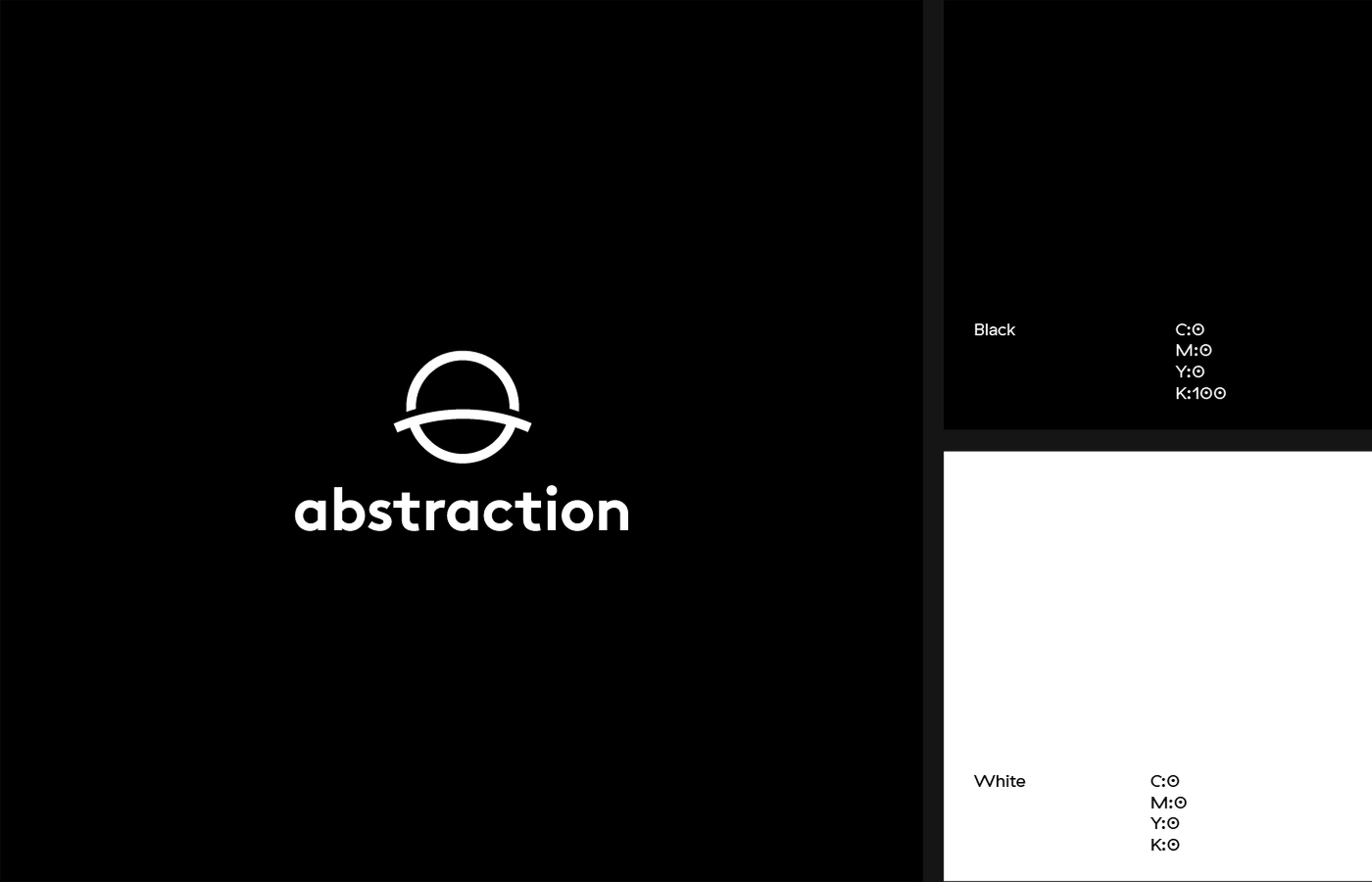
Combined logo color
Our logo uses black and white in its’ most purest forms. In rare occasions — when our logo is displayed on a yellow background — always use black for the color of the logo. Never use the white logo on a yellow background. And never use a yellow logo in any case.
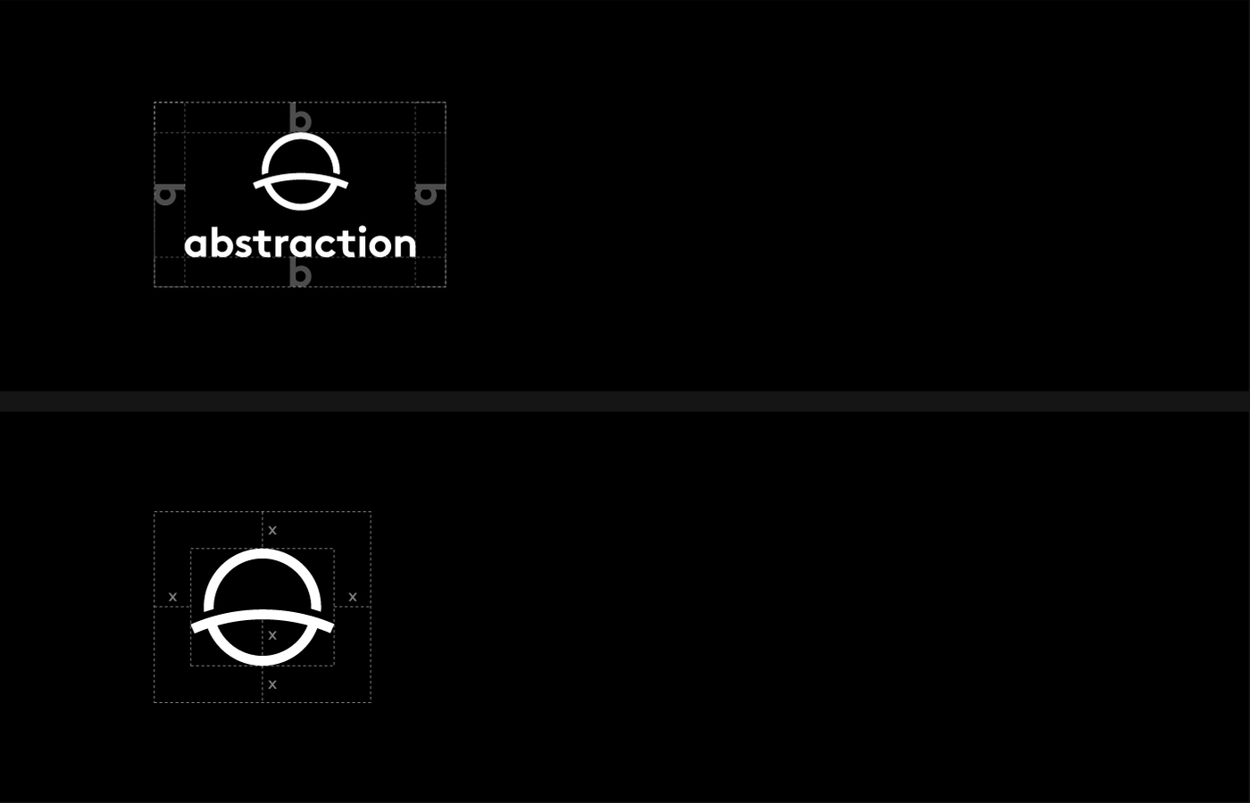
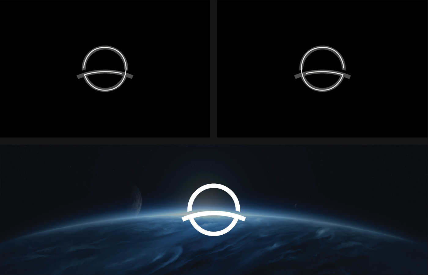
Exclusion Zone
Our logo should always have space to breathe. That's why it's important to take the exclusion zone in to consideration. The exclusion zone for the combined mark is equal to the ‘b’ in the wordmark. The exclusion zone for the logomark is equal to the height of the gap in the lower-end of the mark.
Incorrect logo usage
Like we said, our logo is crafted with care, so please treat it well. Here are some rules to live by.:
- Do not change the color of the combined logo in any case. Yeah, pink is cool. Just not for Abstraction.
- Do not change the type of the logo.
- Do not use the logo on crowded backgrounds.
- Do not distort, skew, or alter the logo in a way so it’s not in proportion anymore.
Logomark
This is our logo mark. It may be used on its own, but only as a visual / aesthetic support.
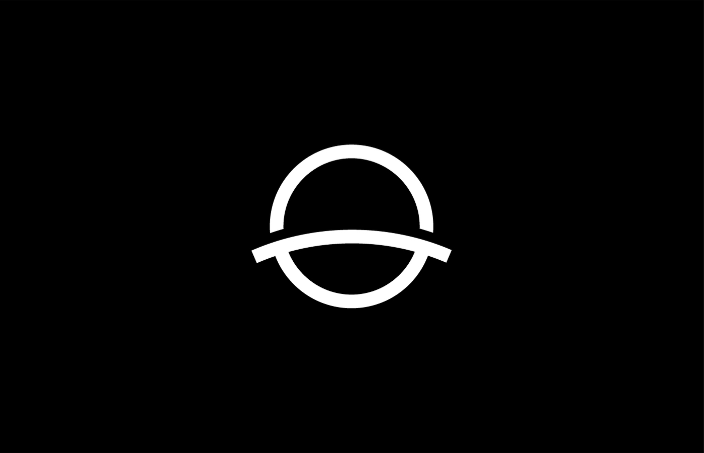
Logomark roots
On one hand our mark resembles the horizon that correlates to the ‘beyond boundaries’ mindset. On the other had it makes a reference to the old ‘Abstraction Games’ name, by combining its initials.
Wordmark roots
Our wordmark is based on the ‘Brown’ type by Lineto. We use a lowercase ‘a’ in order to enlighten our 'approachable' value. Making use of the lowercase 'a' also provides us with an aesthetically balanced wordmark.