- No results found for query "" 😔
Typography
Our typography is one of our boldest brand assets. You might have noticed that we like to go big. Our headlines are most often onproportionally big. Especially in contrast with our body text. We do this to empower that modern 'boldness' value that mirrors the 'boutiqueness' value.
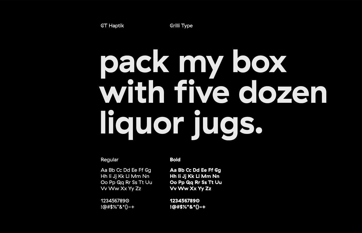
Primary typeface
Our primary typeface is called ‘GT Haptik’ and it's designed by Grilli Type. We use the ‘bold’ version for headlines, hence ‘bold’. ‘Regular’ we use for our body text, subtitles and captions.
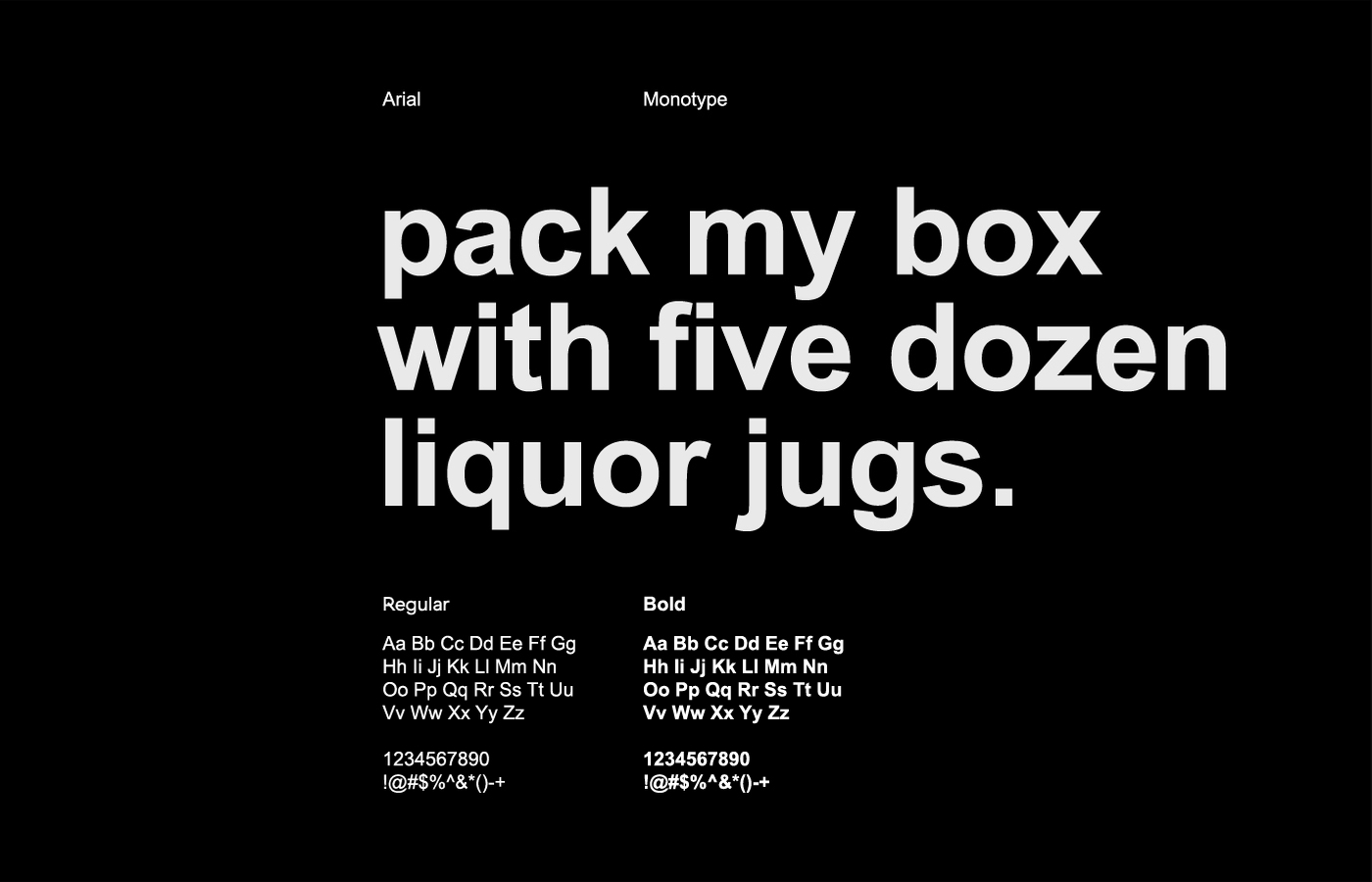
Secondary typeface
It might occur that our primary typeface can’t be used. Some applications just don't support custom typefaces. We then use Arial as a replacement.
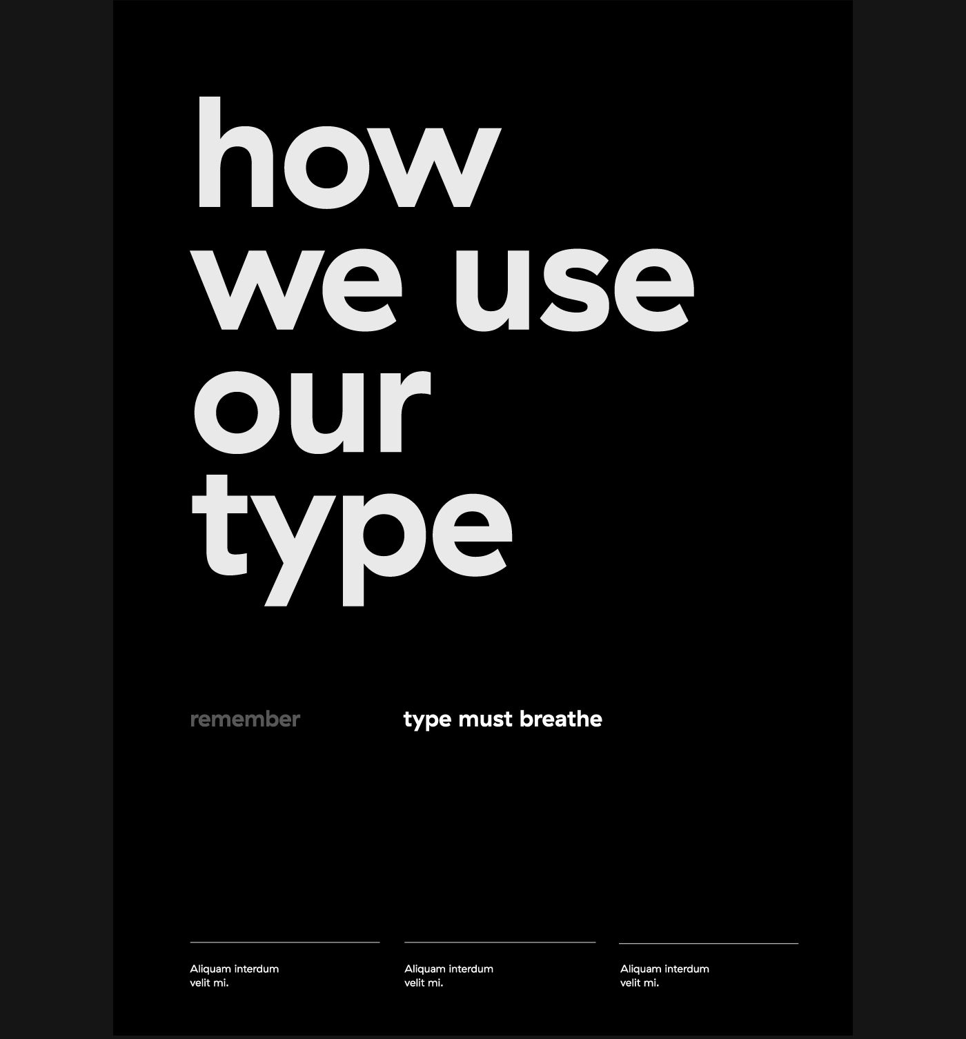
Type in use
The example below shows how our type is intended to be used. And remember, type must breathe!